


I have a little story for you 📖
The morning my fiancé and I were leaving our apartment in Bozeman, MT and driving to our new home in Wisconsin, we had a problem — we couldn’t fit everything into our car.
On top of that, we had too much trash and no dump to take it to. We’d get fined if we left it in our apartment, so we planned to try to schedule a last-minute trash pick-up or leave it on the curb and post ‘free stuff’ on Facebook Marketplace.
That same morning, the City of Bozeman was coming to pick up our trash cans. I was hauling another bag of trash to the curb when I saw a man from the City of Bozeman staring at all our trash and shaking his head.
I apologized profusely, telling him we didn’t put it there for him to deal with, and we were trying to get rid of it, but had to leave that morning. He was quiet, so I apologized again and went back inside.
The next time I came outside, he wasn’t alone — he had called a dump truck to come and take care of all our trash at no cost to us.
We thanked him and asked how we could help. He said it was fine and to keep moving out.
Helpful people are not just appreciated, desired, and adored — they’re remembered.
Helpful products are the same, and they get there with the assistance of helpful UX content.
Helpful UX content goes above and beyond to make an experience seamless with information that takes away any hassle.
There are 4 key strategies for elevating your UX content to be more helpful:
- Answer any and all questions that could come up
- Surface the right information at the right time
- Uncover what context is *actually* helpful
- Translates the value of facts for the user
1. Answer any and all questions that could come up
Whether you’re building a 4-screen or a 14-screen flow, attention to detail matters.
And not just keeping an eye out for typos and grammar mistakes — masterful UX writers pay attention to the details that aren’t on the screen.
As builders of products, we’re equipped with all the knowledge on how these products work. We know if the user can change something later or if their legal name is required.
Users don’t know all that we know, and we need to break out of our bubble and pay attention to the details missing from the screen.
So, before we tie a bow on our UX content, we need to step outside ourselves and think of every question that could come up for a user — whether they know it or not.
A great way to do this is to QA your UX copy against the PRD (product requirements document — this will come from the product manager.)
Look for details about the products’ constraints, and think about whether it’s something that would be helpful for someone going through your flow.
2. Surface the right information at the right time
Great products are like an onion (told you onions weren’t going away) — they’re full of complexity that’s only revealed one layer at a time.
Just like you wouldn’t take a big bite out of an onion, it’s important to not put every piece of information on the first screen in your flow.
Not only is that overwhelming for the user, but the information also becomes unhelpful, because you didn’t go through the process of filtering what the user should care about at that moment.
Attention spans are small, and if we want to help people get to where they want to go, we need to surface the right information at the right time.
Organizing information can feel daunting, especially when the PRD is long. If you want to surface the right information at the right time, you need to start with the content, not the visuals.
When your first step is organizing how the content will appear in your flow, you can understand what layers of the onion make the experience more palatable.
Use a rectangle and a line of text to make boxes that individually house all the information, actions, and goals that need to be in your flow in a tool like Figma.
Then, play Tetris. See which bits add context to other bits. Think about which bits can be combined. Are there bits that serve a more helpful purpose in a FAQ?
If you start diving into the nitty-gritty first, it’s much easier to fall into the trap of complicated screens that are cluttered, not helpful.
3. Uncover what context is *actually* helpful
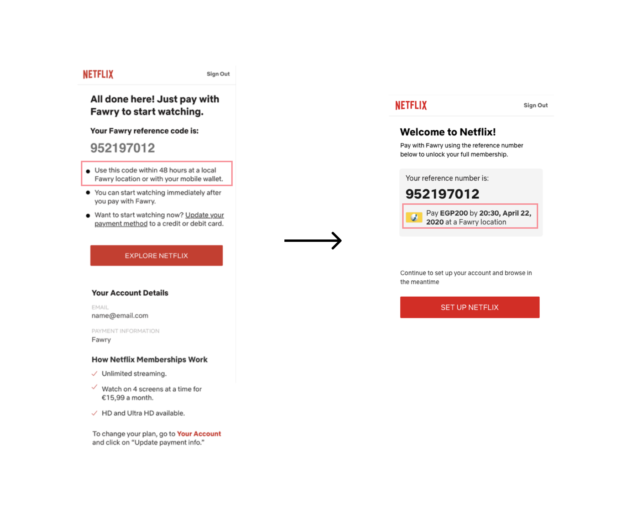
When I worked at Netflix, I worked on implementing an Egyptian payment method called Fawry.
Fawry is a cash-based payment method that works like this:
- Make a purchase online, and get texted a reference code
- Go to a Fawry partner location (think a grocery or corner store)
- Show your reference code and pay in cash
- Get a follow-up email saying you’re ready to start using said service
We don’t have a similar payment method in the US, so there was a learning curve for the team.
Because of our lack of knowledge, in our initial designs, we made a few decisions that we thought would be helpful. But, it turned out they weren’t helpful for people who usually pay with Fawry.
For example, on the confirmation screen in our initial designs, I wrote:
Use this code within 48 hours at a local Fawry location or with your mobile wallet.
After getting feedback on said screen in a diary study, we learned that it would be more helpful for people to see the exact time and day the reference code expires, not just 48 hours from now.
And that made sense — the clock ticks from the time they land on the screen, and it’s unlikely they’re going to note the time and remember when 48 hours would be from that moment.
The revised copy read:
Pay EGP200 by 20:30, April 22, 2020 at a Fawry location.
Check out the before and after here 👇
Helpful UX content uncovers what people actually need to know in the format they need to know it in.
The best way to find out what biases you have about what’s helpful information is to show your designs in user research. Ask what people find helpful, what they would do differently, and what’s unnecessary context.
That way, you can cut the fluff and get to the root of what’s helpful quicker.
4. Translate the value of facts for the user
Have you ever read something and thought, “uhhh, why should I care?”
Users are no different, and they’re thinking that when they see your UX content.
That’s why you can’t just state the fact — you have to tell users what value is in it for them.
Take this guided onboarding:
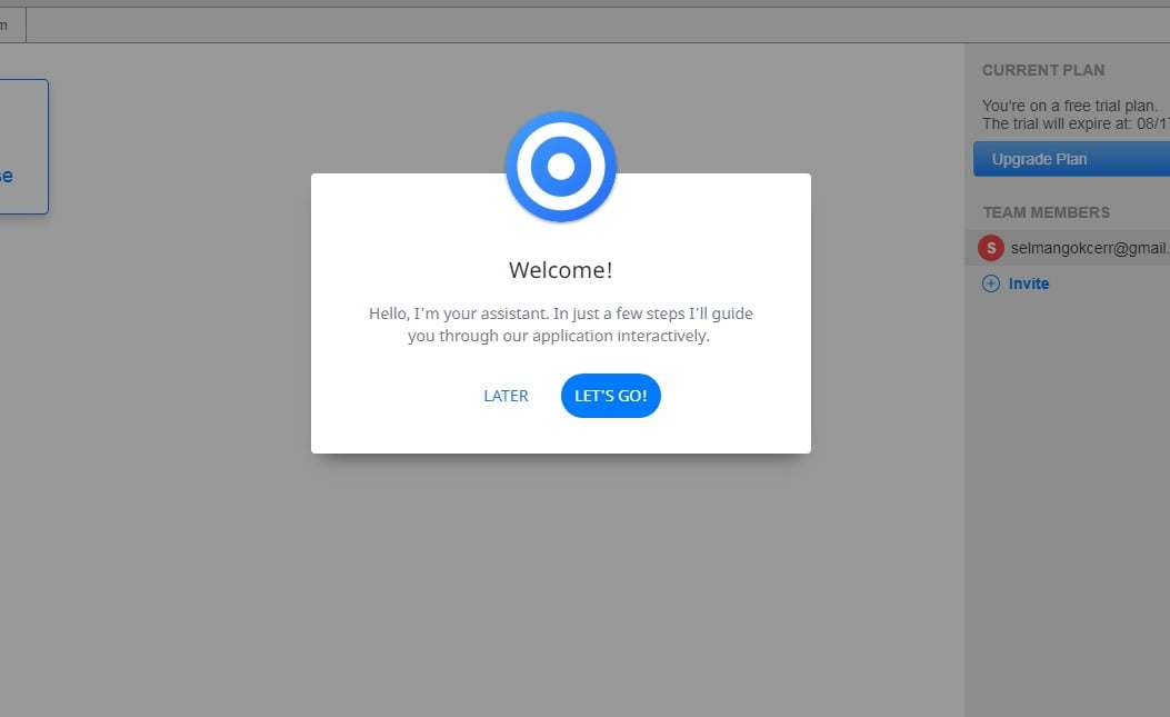
So, you read this and gather they’re gonna show you through the product. But why should you care? Is it imperative to using the product? Are they going to show you everything, or just what you need to know?
Instead of just stating the facts, more compelling microcopy would be:
In 5 minutes, we’ll show you how to create your first project, so you can hit the ground running ASAP.
In my revised example, the fact is “we’ll show you how to create your first project,” and the value is “so you can hit the ground running ASAP.” Without the value, it’s less compelling, and it’s unclear why a user should care or continue.
Happy UX writing 🖖


