


You know buttons? Well, in UX writing, we make it complicated and call them calls-to-action, or CTAs.
What does call-to-action mean in UX writing?
Calls-to-action (CTA,) or the call-to-action button, direct someone to the desired action on a screen. This can be to increase conversions or to get them to the next step.

CTAs can be buttons, hyperlinks, or even actionable lines of microcopy.


A CTA should communicate exactly what happens after someone clicks or taps the button.
Why do UX writing buttons matter?
Buttons, or calls-to-action, matter because they make it clear what the user should do. Without a call-to-action, a user is literally stuck on a screen. Calls-to-action are the stitches that glue together user experiences.
To make an absurd point, here’s a screen with a call-to-action:

And here’s it without a button, or call-to-action:

You literally can’t go anywhere, and it creates a dead-end. That’s why CTAs matter.
What makes effective UX writing buttons?
Effective UX writing buttons:
- Start with a verb
- Create a conversation together with the headline
- Are clear about what happens after someone takes action
You can have a primary CTA and a secondary CTA.
Traditionally, a primary CTA directs toward the desired action, or “happy path.” It’s where you’re hoping someone will go to continue in the flow.
A secondary CTA is, traditionally, a way out. It can be an opt-out or a way backward in a process.
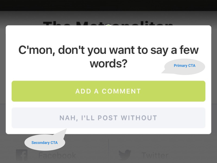
Take a look at how CTAs play out in this example from Tower:
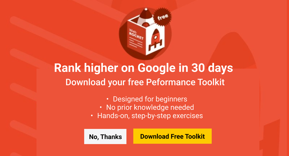
UX writers think of a headline and CTA as call and response.
A headline makes the call (ex: “Download your free Performance Toolkit,”) and the CTA responds (“Download Free Toolkit” or “No, Thanks”.)
The target user can read the headline and CTA and understand:
- The value
- The main point
- What’s being asked of you
With secondary CTAs, it’s important to always offer options. Someone should never feel pressured into a decision, and because of that, we need to always offer an “escape path.”
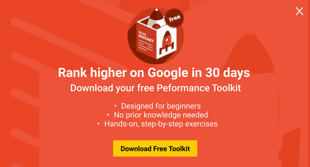
A secondary CTA is one option. We could also use an “X” in the right corner to show the modal is dismissible.
Keep UX writing buttons positive
When it comes to digital products and mobile apps, it’s important to always keep CTAs positive and not instigate guilt.
No one should be made to feel guilty, bad, or FOMO for opting out of something. Not only is it an ineffective strategy, but you’re also incentivizing people to do something they don’t want to do, which muddles your user base with unqualified leads.
Here’s an example of what not to do:
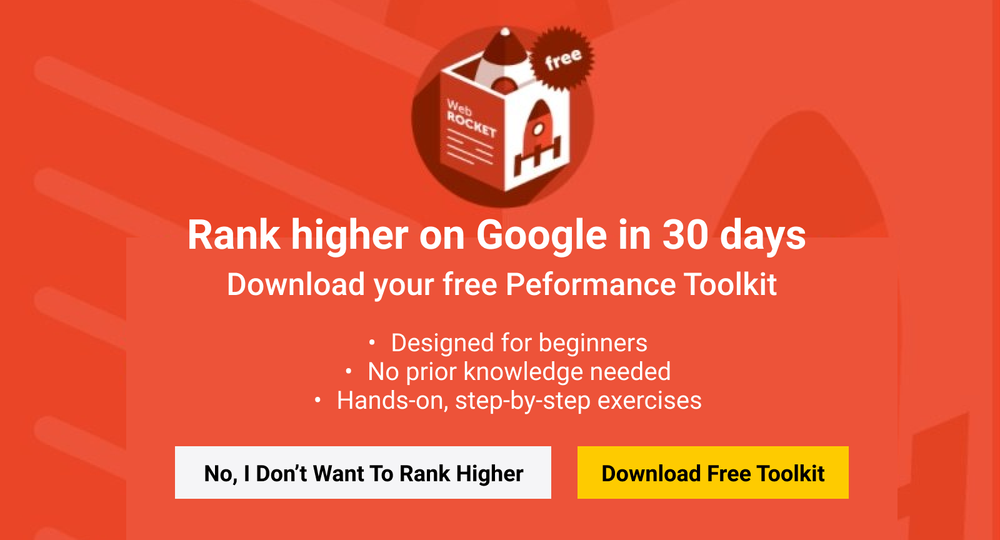
Of course, someone wants to rank higher. They might just not want to download the Performance Toolkit, and their decision is perfectly acceptable.
Don't use a string of “Next” or “Continue” buttons
The best buttons always let someone know what's on the other side.
CTAs like “Continue” and “Next” aren’t ideal for that reason — they lack the added context needed to give the user peace of mind as to what's coming next.
For example, take a look at Opendoor’s flow to get prequalified for a home loan:

There’s a string of “Next” without any context as to what comes next.
Now, take this iteration:
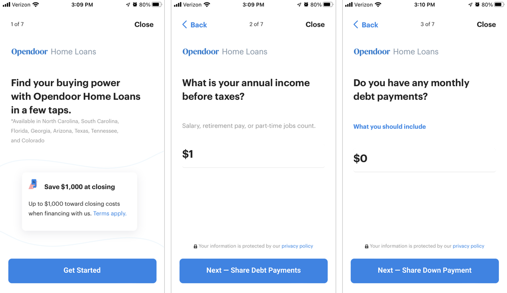
By adding context to the “Next” CTAs, we provide someone going through the flow peace of mind as to what comes next, so they can anticipate progress and process.
It’s important to note this format of CTA won’t always work. Take this additional example from Opendoor:
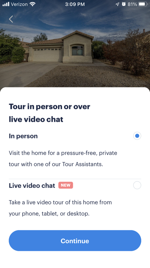
An in-person tour and video chat tour go to different places, so having a more specific CTA would be misleading.
Good examples of UX writing buttons
Dropbox Paper

This CTA from Dropbox Paper is effective because it lowers the barrier to entry to a somewhat-confusing product. Set up a Paper doc? Seems intimidating. Start brainstorming? Seems fun and doable.
Square
This CTA from Square is effective because it does a lot of heavy lifting. Not only does it describe the offering, but it alludes to the free trial that’s offered on the next screen. It’s a great example of being transparent about what someone is getting into when they click or tap a CTA.
Lyft

This CTA from Lyft is effective because it shows progress, or lack of progress. If you’re like me, you’re always worried about requesting a ride before you’re ready. By being explicit about selecting “Shared,” as opposed to saying something like “Continue,” Lyft is explicitly stating you’re only at the point of selecting the type of ride you’d like, not committing to anything yet.
Bad examples of UX writing buttons
Earnin

The “Max Info” CTA from Earnin, a fintech app, is ineffective because it doesn’t clearly describe what someone is selecting or where they’ll go. Additionally, “Max” is an app-specific jargon someone new to the app wouldn’t understand. By placing jargon in a CTA, it confuses the message even more. Adding a verb like “Explore” to the beginning of the CTA could offer a more explicit experience by explaining you can go to the destination to learn about “Max Info.”
Fitbit
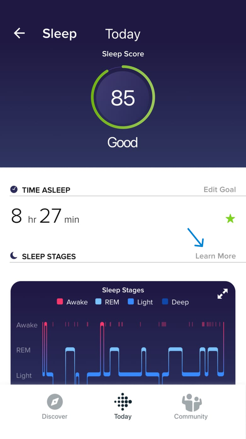
“Learn More” is a widely used but dangerous CTA. That’s because it doesn’t offer any context as to what someone can expect.
According to Nielsen Norman Group, a “Learn More” CTA “creates uncertainty because users don’t know what to expect if they click, or whether it’ll be worthwhile to wait for a new page to load. That feeling of uncertainty can cause users to hesitate and shift into a state of cognitive strain.”
It’s also an accessibility concern because people using a screen reader can’t quickly glance back to the preceding microcopy to see what “Learn More” refers to.
That said, if the microcopy that comes before “Learn More” makes it obvious what’s to come, then it’s OK to use. But Fitbit doesn’t in this example, which is why it’s an ineffective CTA.
GoodReads
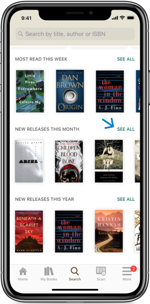
Similar to “Learn More,” using words like “See” and “View” in CTAs is troublesome from an accessibility perspective. “See” in this CTA from GoodReads excludes those who can’t see and might be using a screen reader. Therefore, it’s best to use verbs like “Explore” or “Discover” instead.
There’s more than what initially meets the eye when crafting effective CTAs in UX writing and content strategy.
A simple “Next” or “Continue” can work, but there’s much more we can do to elevate and continue to clarify user experiences using calls-to-action.
Happy UX writing 🖖


