


If you're a big equality person, you're gonna dig accessibility and UX writing.
Accessibility is the concept of whether a product or service can be used by everyone — however they encounter it.
Types of accessibility issues include:
- Visual (e.g., color blindness)
- Motor/mobility (e.g., wheelchair-user concerns)
- Auditory (hearing difficulties)
- Seizures (especially photosensitive epilepsy)
- Learning/cognitive (e.g., dyslexia)
- Incidental (e.g., sleep-deprivation)
- Environmental (e.g., using a mobile device underground)
Accessible microcopy ensures everyone’s included, and the big thing with accessibility in UX content is screen readers.
People with impaired vision usually read the internet using screen readers. Since they can’t see the cursor, they use keyboards.
And instead of using a mouse, they use the tab and arrow keys to navigate between websites and pages and the enter button to click links and buttons.
Screen readers read elements aloud as the user focuses on them and lets them know whether they’re on a button, image, or text link. Aka, instead of getting a grasp on the entire screen, people with impaired vision only know the element they’re focusing on at any given time.
To make sure your UX content is inclusive of visually impaired people, there are 6 key best practices:
- Use live text, not images
- Be mindful of the order of elements
- Don’t rely on visuals for context
- Avoid words like “click” and “view:
- Write descriptive, clear calls-to-action
- Add alt text to images, icons, and illustrations
Let me explain…
1. Use live text, not images
Screen readers can only read live text from web pages. So, if you’re using an image with text on it, people using screen readers won’t know it’s there.
When a person with impaired vision lands on a page like that, their screen reader will only read out the alt text of the image. Unless the alt text is descriptive, the user might be confused about where they ended up.
That’s why it’s best practice to also use live text, so screen readers can pick up on it.
Here’s an example of a website that puts text in the image and repeats it as live text, so everyone is in the loop:

2. Be mindful of the order of elements
Have you ever tried to browse a website using your keyboard?
If you have, you already know the tab button and arrow keys move you top to bottom and left to right. Well, people with visual impairments browse the internet like that.
When it comes to UX writing, you need to present the information the user needs to complete a task before they take action.
Here’s an example of what not to do:
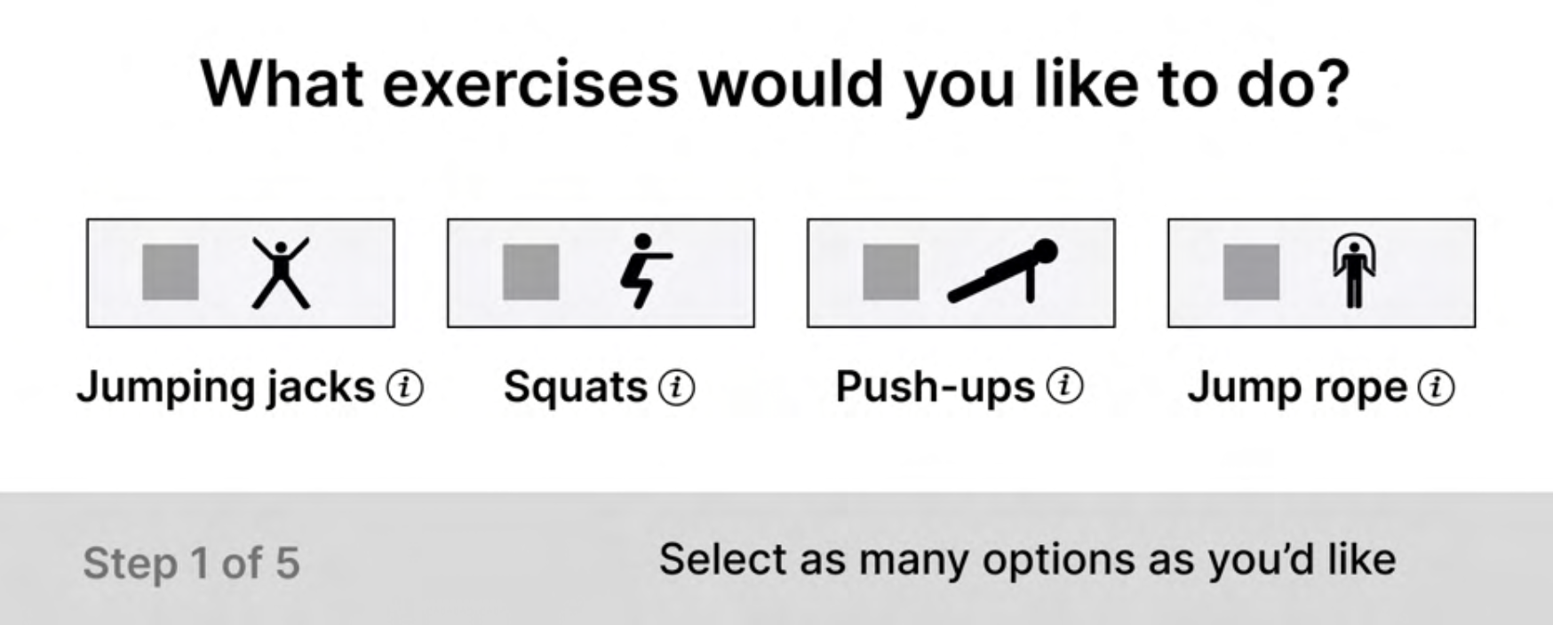
Notice how the name of the exercises and info icons are positioned under the clickable buttons.
When a visitor using a screen reader visits this site, they’ll navigate between the icons first, and then hear “Jumping jacks”, “Squats,” “Push-ups,” and “Jump rope” later. The visitor would have to remember the order of exercises, go back, and make their selection.
3. Don’t rely on visuals for context
Don’t rely on visuals to convey information — be clear in the microcopy.
Here’s a quick trick: Remove all visual elements from your screen. Is it still easy to understand where you are and what you need to do next?
Take this example:
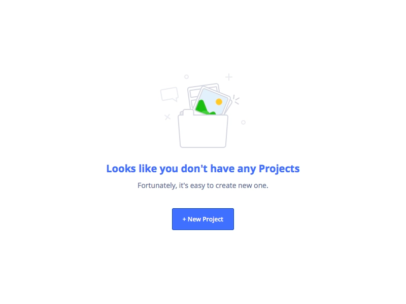
If you took away the folder, you’d still be able to easily understand what’s going on and where to go next.
4. Avoids words like “Click” and “View”
Words like “Click” or “View” are common in calls-to-action, and the problem with them is they assume how someone is navigating a product.
For example, a visually impaired person won’t be “Viewing” the product.
Instead, focus on impartial verbs like “Hit” or “Select.”
5. Write descriptive, clear calls-to-action
Fun fact: You can use your keyboard to navigate from one headline, link, or button to the next on a web page.
People with visual impairments do the same thing to quickly get an idea of what a page is all about.
That’s why it’s important to write descriptive, clear calls-to-action — it improves your site’s usability (and it’s user experience) for everyone – including users with visual impairments.
Take this example:
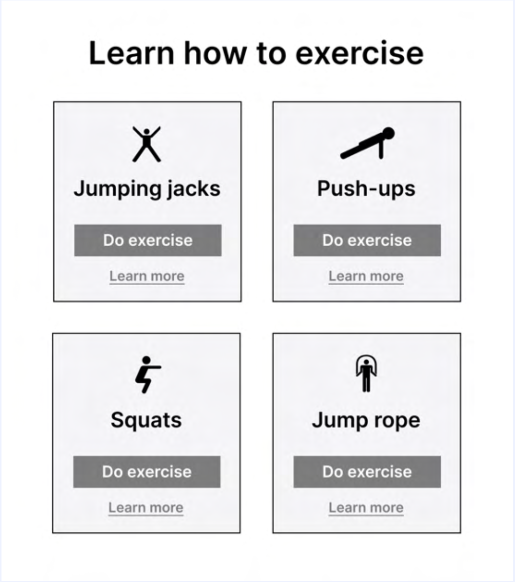
If a user decides to navigate between the buttons on this page, they’ll hear “Do exercise” repeated over and over again. And if they jump from link to link, they’ll listen to “Learn more” four times without understanding which exercise it’s talking about.
More accessible calls-to-action would be ”Do squats” or “Learn how to squat.”
6. Add alt text to images, icons, and illustrations
Whenever you include images or icons in web pages, remember to add alt text.
Whenever a visitor comes to your site using a screen reader, they hear the alt text for your image instead of seeing the image. Because of this, it’s a good idea to add alt text to images and icons that convey some information or build context.
Here’s an example of alt text in action:

Accessibility recap
That was a lot, so let’s quickly rewind on the main points you need to keep in mind when writing accessible microcopy:
- Always use live text instead of images with writing on them
- The order of UI elements should be accessible; information and instruction come before action
- Write clear microcopy that doesn’t rely on visuals to convey relevant information
- Create a descriptive call-to-action to give readers a clear idea of what to expect
- Add alt text to images, icons, and illustrations that enhance the user’s understanding or build context
Happy UX writing 🖖


