


If you're like me, making progress is the bomb. Whether it's crossing off a to-do task or picking up a heavier set of weights, it just feels good to move forward.
The very same is true in the world of UX. Just like you and me want to keep moving forward in life, our users want to make progress in their journey through our product.
The idea of progress is closely related to the visibility of system status heuristic and progressive disclosure.
Progress is what it sounds like — showing the user that things are moving in a productive direction. Progress is typically shown through indicators, like this:
And this:
Why does progress matter?
Imagine if this membership had no organizational structure or lessons, and it was just a continuous wall of text. You’d have no clue how close you are to the end or how much you’ve accomplished.
While that wouldn’t alter the state of your life or your ability to learn this material, without communicating your progress to you, you’d get easily fatigued and feel like this is never-ending. That’s because you’d lack control over your journey, and control provides peace of mind.
It works the same with digital products — communicating progress orients the user in their journey, so they can feel peace of mind and a sense of control. Equipped with the feeling of control and feeling rest assured, progress helps the user get tasks done.
How do you effectively communicate progress?
Imagine it’s Halloween night, and you’re about to go through a corn maze, like this:

If you’re like me, you’re thinking it’s pretty spooky. You’re telling yourself this is all an invention to scare you “for fun,” and it’s designed that you come out the other end, so the creator doesn’t get sued.
Once you take the first step into the maze, your only option is to make progress. That way, you can accomplish your goal of getting the heck out of there.
Users aren't so different. Entering a product can be like entering a Halloween corn maze — what’s next is unknown, and you hope it’s worth your while.
To effectively communicate progress, we can empathize with ourselves as corn mazers. Imagine the point of the maze wasn’t to scare us, and there was a guide there to help us along our journey.
To give us a feeling of safety and peace of mind as we move through the maze, a good guide would be:
- Up front about where we are in the maze
- Clear about what we need to do to get outta there
- Transparent about what’s around the corner
- Share how much is left of this horrible experience
- Tell us how to get outta there ASAP if we just can’t handle it
The same is true of digital products. Except instead of Halloween maze guides, we have UX writers 😇
To get the user from point A to point B with peace of mind and feeling in control, a UX writer effectively communicates progress by writing microcopy that’s:
- Up front about where the user is in their journey
- Clear about the tasks required to reach mission complete
- Transparent about what’s coming next
- Shares how much of the journey is left
- Has a very clear ASAP exit route
Effective communication of progress is up front about where the user is in their journey
Knowing where the user is in a journey, again, helps set expectations and gives the user peace of mind.
If the user knows they have a lot to do, they can make the judgment call on if they have the time to do it right now. If they see they’re almost done, it becomes a no-brainer to finish up.
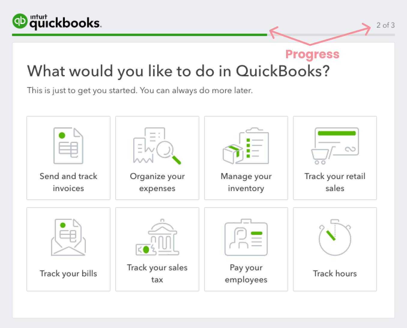
In this example from Etsy, they indicate the user's location visually with the open circle vs a checkmark:

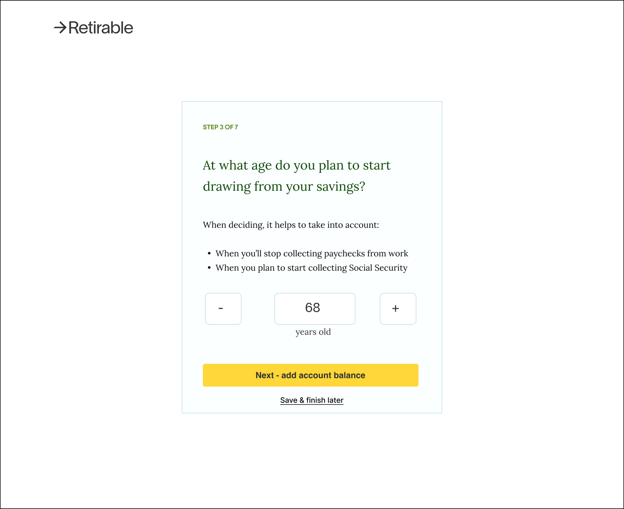
Similarly, Retirable shows the user their location by stating “Step 3 of 7:”

By being up front about where the user is in their journey, you empower them with the confidence to move forward.
Speaking of moving forward…
Effective communication of progress is clear about the tasks required to reach mission complete
Going back to my earlier example, if this membership had no organizational structure or lessons, you’d have no idea what needs to be done. By organizing tasks, you let users anticipate their future, giving them peace of mind.
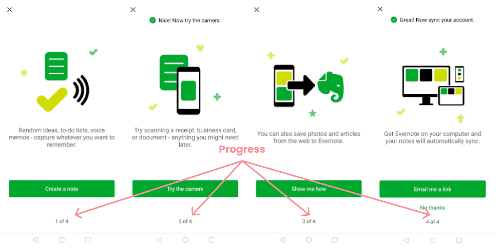
Continuing with the Etsy example, take a look at how they clearly state all the steps you’ve accomplished and what still needs to be done:
This lets the user set the right expectations and plan accordingly.
Effective communication of progress is transparent about what’s around the corner
Most of us don’t like surprises. And especially when it comes to things most people don’t enjoy, like signing up for things and making payments, which are two very common user journeys.
We can make the unenjoyable more pleasant by eliminating surprises and being transparent about what’s around the corner, or what’s coming next.
Using the same example, Etsy is transparent about what’s around the corner by spelling out every step in the process in the progress tracker:
And Retirable does so by sharing what’s around the corner in the button copy:
Both of these tactics are excellent ways to transparently communicate progress. If you use ‘em together, that’s a progress powerhouse.
Effective communication of progress shares how much of the journey is left
This is kinda implied by the past points, but by showing the user where they are in the journey and what needs to be done, you’re being transparent about what’s left to do.
In the Retirable example, the user is on “Step 3 of 7,” which means they have 4 steps left:
By being up front about what remains, the user can make the call if they have the time, energy, and wish to continue.
Effective communication of progress has a very clear ASAP exit route
Sometimes things come up, and you need to abandon ship right here, right now.
This could be because your dog is puking, or it could be because you realized maybe it isn't the product for you, and you want time to think about it.
Effective user experiences design for every scenario (hello, usability heuristic #3 👋,) and that includes progress.
A great way to design for every scenario when communicating progress is to add a “Save & finish later” option. That way, the user doesn’t have to start from scratch, and they can still let life happen.
For example, we can add a secondary CTA reading “Save & finish later” to the Retirable example to make sure the user can feel confident, no matter what happens:
Good examples of progress
Shopify store
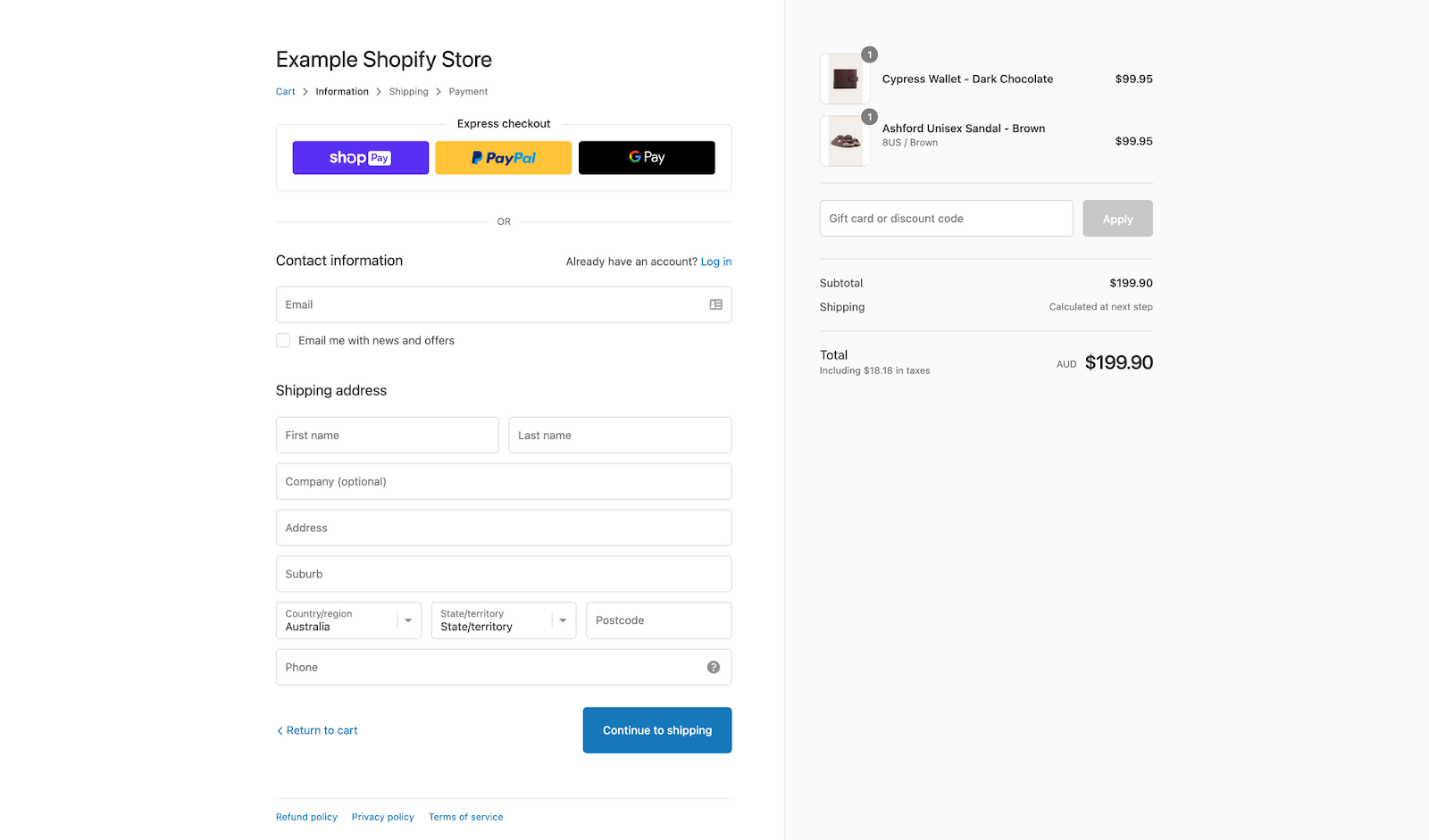
Shopify shows progress clearly and simply with their minimalistic, text-based progress indicator. The blue text color indicates where you are, and you clearly understand what’s coming next.
A random contest creator

This content creator is very clear about the steps required to create a contest. “Additional criterias” might be a bit vague (and grammatically incorrect 🤓.) But they had a very clear idea of how to give someone peace of mind throughout the user journey.
Shyne
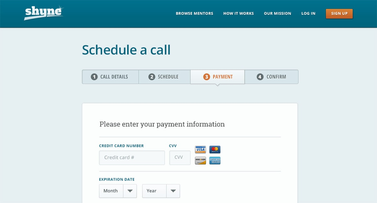
Shyne shows progress in a very simple way. You know where you are and what’s required of you. There’s no fluff, just peace of mind.
Bad examples of progress
Plaid

Plaid lets you connect your bank to other apps. Connecting your bank can be kinda scary, and Plaid doesn’t have any progress indication at all. A very big missed opportunity for Plaid.
Wealthfront

Similar to Plaid, investment app Wealthfront has no progression indicator when connecting a funding account. Moving money is always a bit stressful, so again, a big missed opportunity.
Fitbit
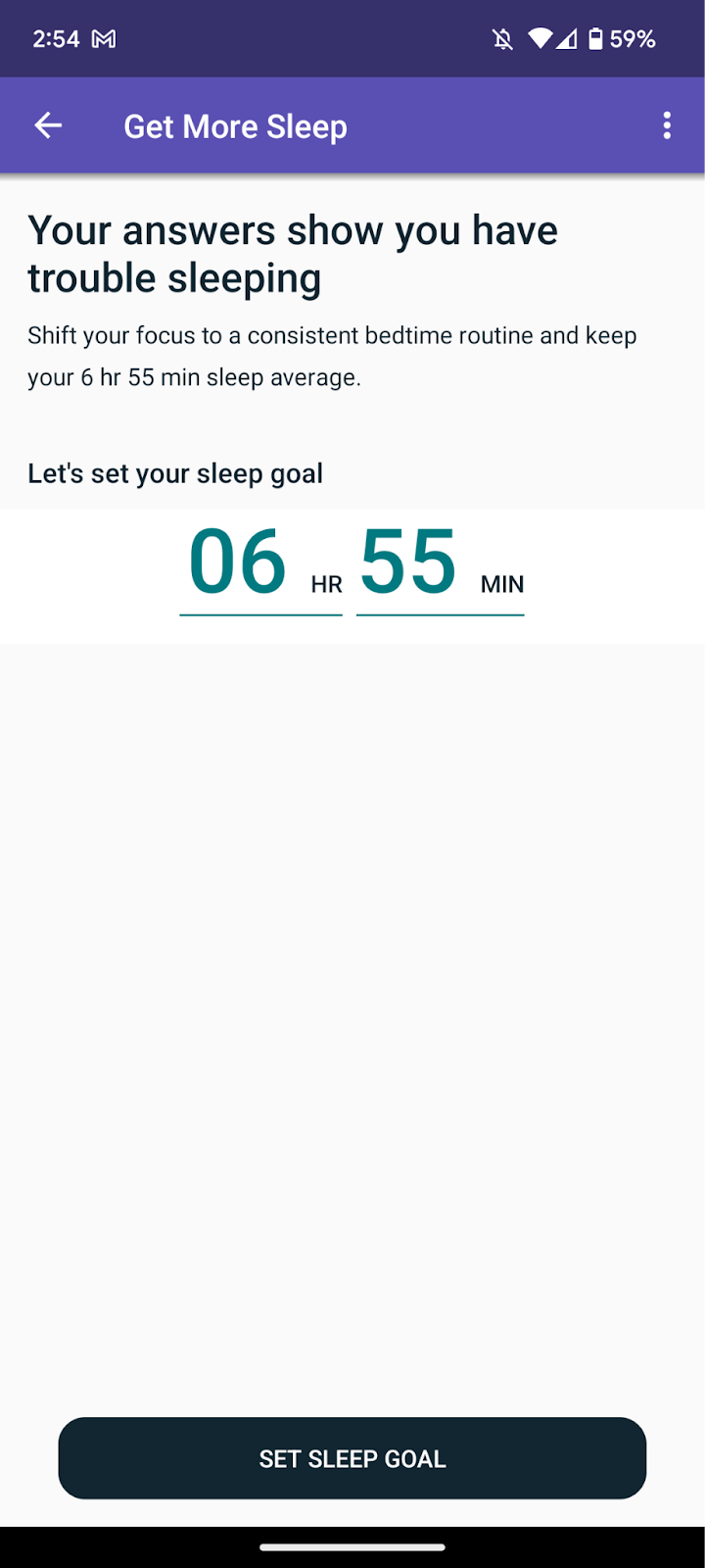
Get More Sleep is a program run by Fitbit to help Premium users get, not surprisingly, more sleep. The set-up process is long, and Fitbit gives you no indication as to where you are in the journey. This can easily lead to drop-off and unhappy users.
Happy UX writing 🖖


