


Have you ever filled out a form and been a bit confused about what you're supposed to put there?
That's where placeholder text comes to the rescue 🦸🏻♀️
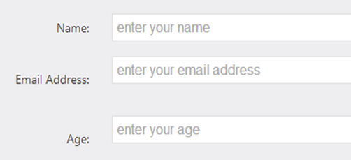
Placeholder text is the text that users see before they interact with an input field.

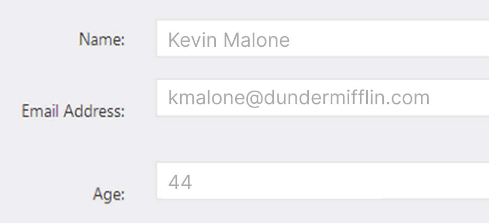
When the user types something in, the placeholder disappears in lieu of the user’s inputted info, like this:

Why does placeholder text UX matter?
Placeholder text gives users a helpful hint as to what kind of information they should put in the input field. In conjunction with the label, the placeholder text makes the user’s cognitive load lower.
What makes effective placeholder text UX?
Effective placeholder text UX:
- Doesn’t replace the label
- Clear > clever
- Serves as an example
Effective placeholder text UX doesn’t replace the label
When you put info into an input field, the placeholder text disappears. And that disappearing placeholder text strains users’ short-term memory.
Without labels, users can’t check all information they provided before submitting a form. That’s why effective forms need labels and placeholder text.
Effective placeholder text UX is clear, not clever
Like labels, placeholder text isn’t the place to have fun. Users aren’t in a playful mood when they’re completing a form — they want to get in and out.
That means effective placeholder text is clear, not clever. When it’s clear, it’s more easily understood. When it’s clever, it makes you think a tad too long.
For example, here’s an example of clear placeholder text UX for a city:

As a recognizable capital of Arizona, “Phoenix” serves as a practical, easily-digested example that will help the user complete the input field.
Now compare that to something clever:

This feels more like a guessing game than helpful microcopy. It might even make you question what kind of information the label is asking for.
When in doubt, clear > clever.
Effective placeholder text UX serves as an example
The placeholder text should give the user an idea of what goes in the input field. It shouldn’t provide instructions. That’s because, once you start typing, the instructions disappear.
Take this example:
The placeholder text adds no helpful information, and instead, repeats what you already intuitively know. What would be more helpful is showing users the expected format of information, like this:
Similarly, once you start typing, you’ll lose the 8+ characters requirement and will, hopefully, have remembered that:

Good examples of placeholder text UX
But there’s no placeholder text…?
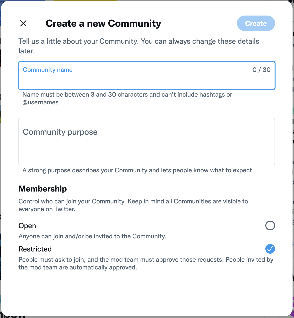
I know this might be confusing as a “good” example, but no placeholder text is a-OK. This example from Twitter is effective because the label and supporting microcopy provide all the information you’d need to fill this out.
Sometimes less is more (but not always, so use your best judgment 🙃)
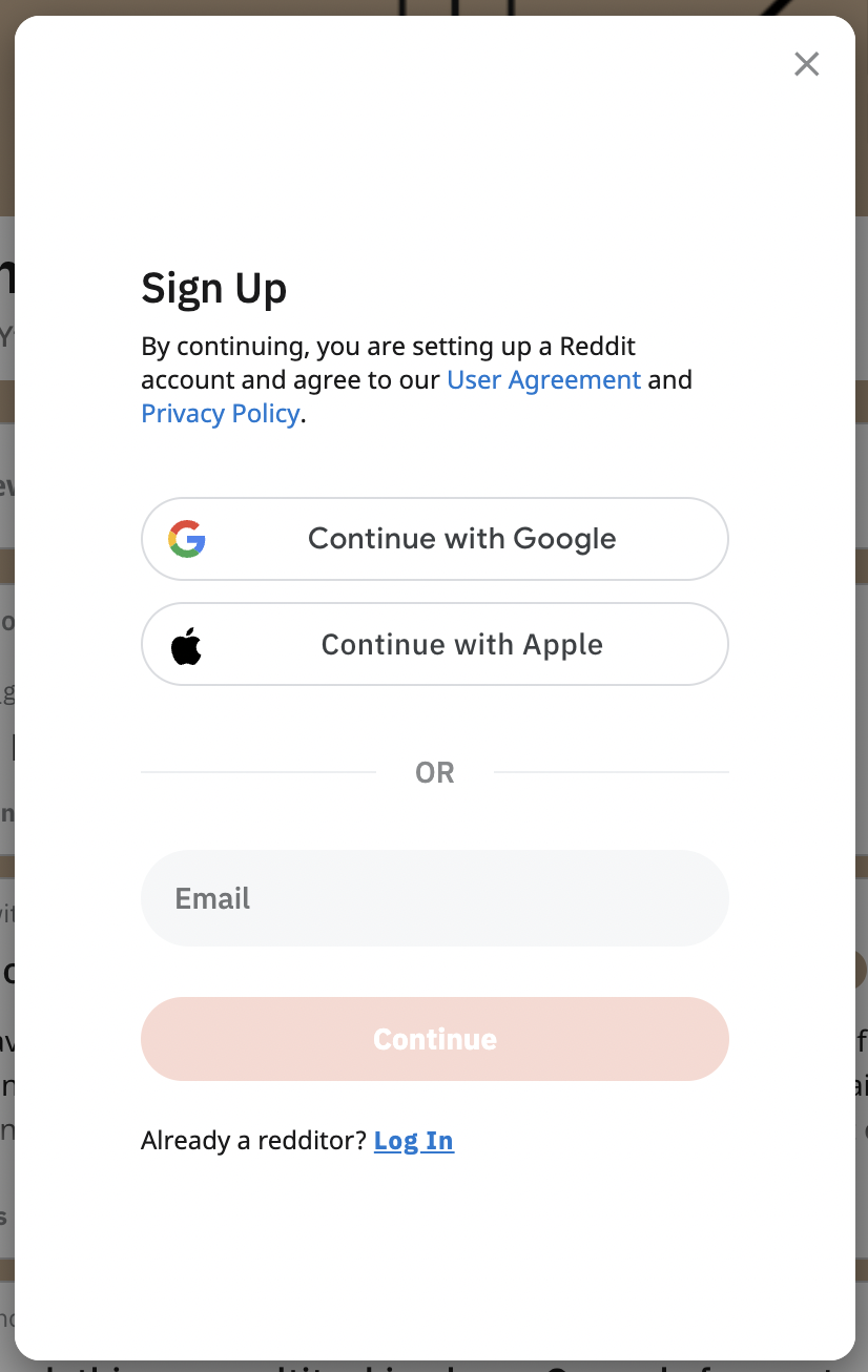
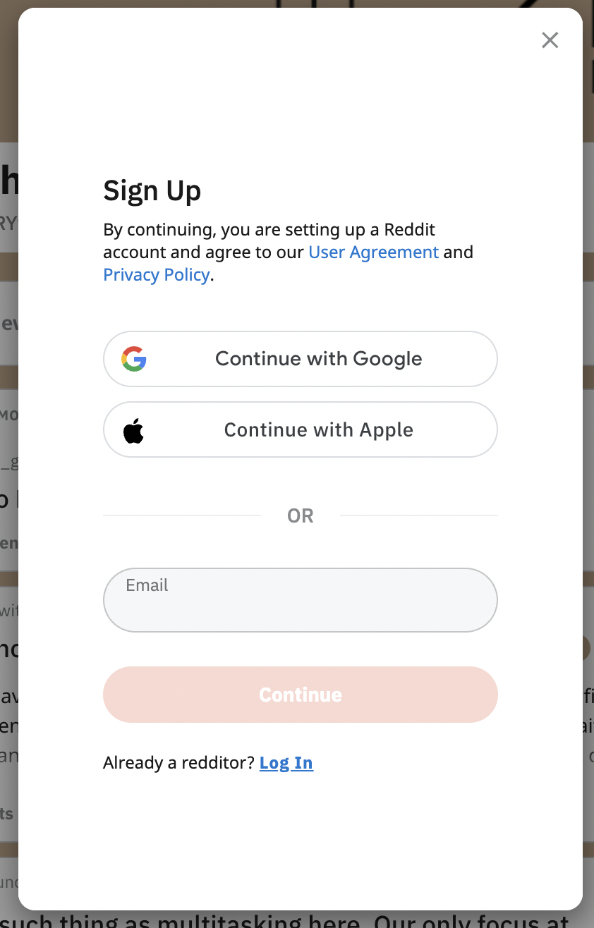
Wait… this is a “good” example, too?
Yes! That’s because of Reddit’s minimalism here. How this screen works is, once you click into the email input field, the “email” microcopy transforms into a label.
Since you don’t need placeholder text, this is an expert solution in the practice of less is more.
A random example

This random example is a good example of showing the user the format that’s expected of them. Dates can come in 10,000 different formats, so this helps the user out.
I’d also add some helper microcopy below, just so the user doesn’t forget the format while typing. If you’re fancy, the helper microcopy could even pop out once the user starts typing 💅
Bad examples of placeholder text UX
Twitter (again)
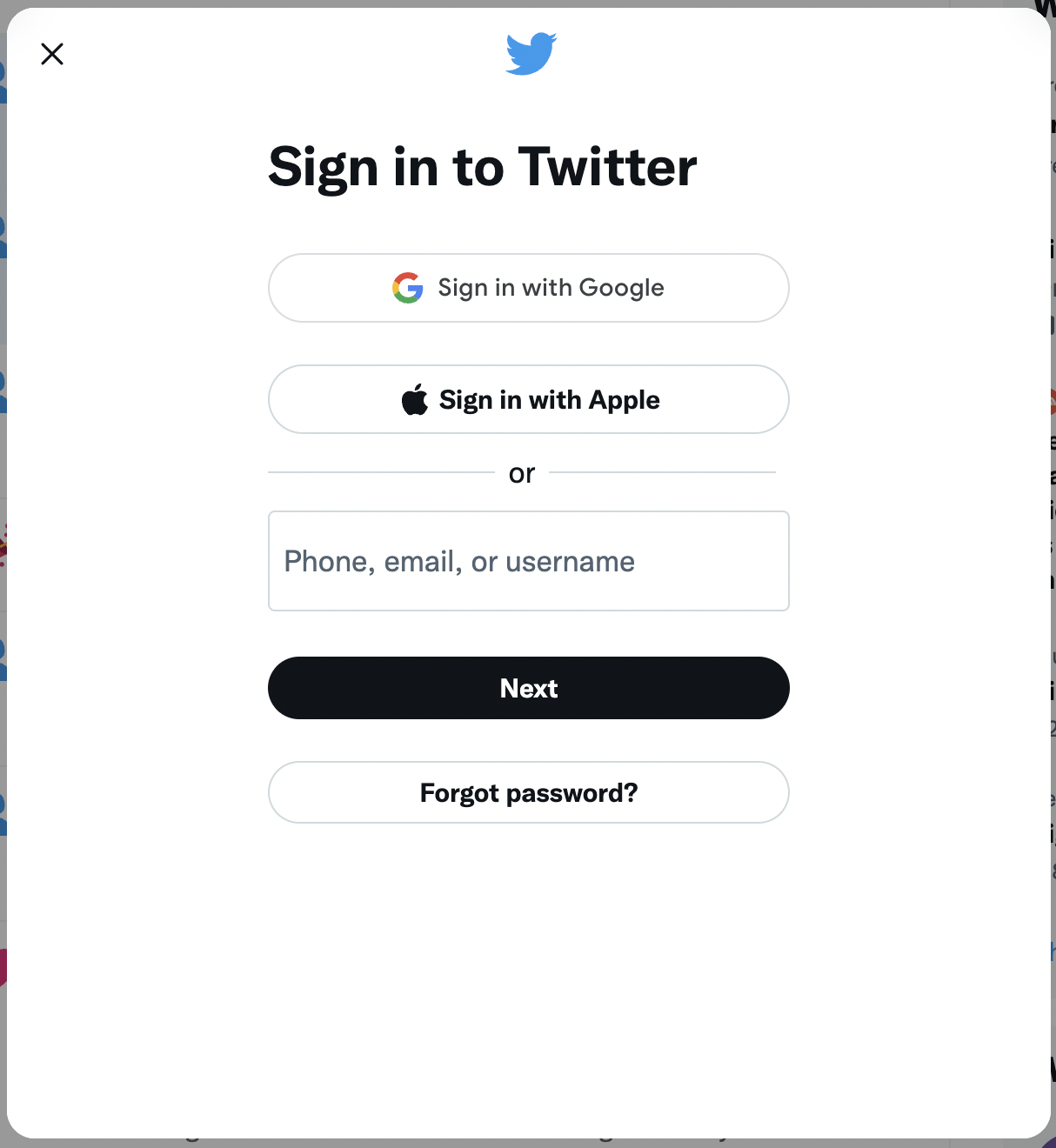
Twitter is pretty inconsistent with their placeholder text UX. Here, you get the helpful info that you can enter your phone, email, or username to sign in, but when you start typing, that goes away. To follow best practice, Twitter should put that info outside the placeholder text.
Amazon
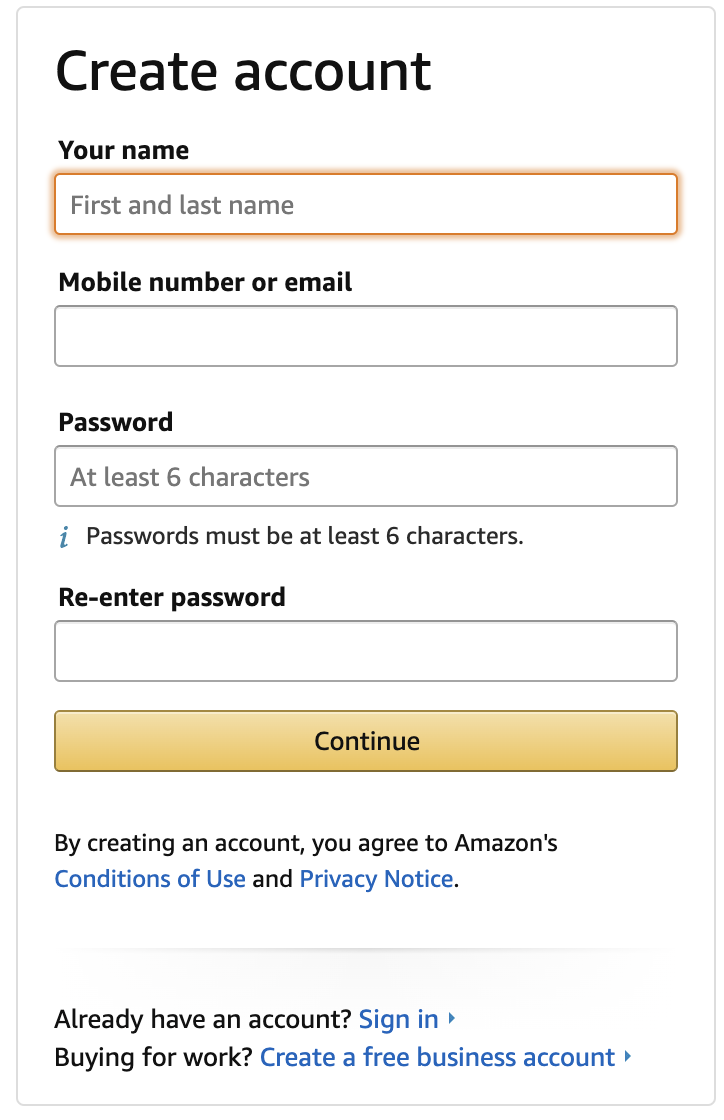
Amazon is not very efficient here. For example, they could change the label “Your name” to “First and last name” to be more clear and concise, and they could get rid of the placeholder text in the password input field because they already say it below.
This just isn’t an efficient use of placeholder text, and Amazon can do better.
Tempo
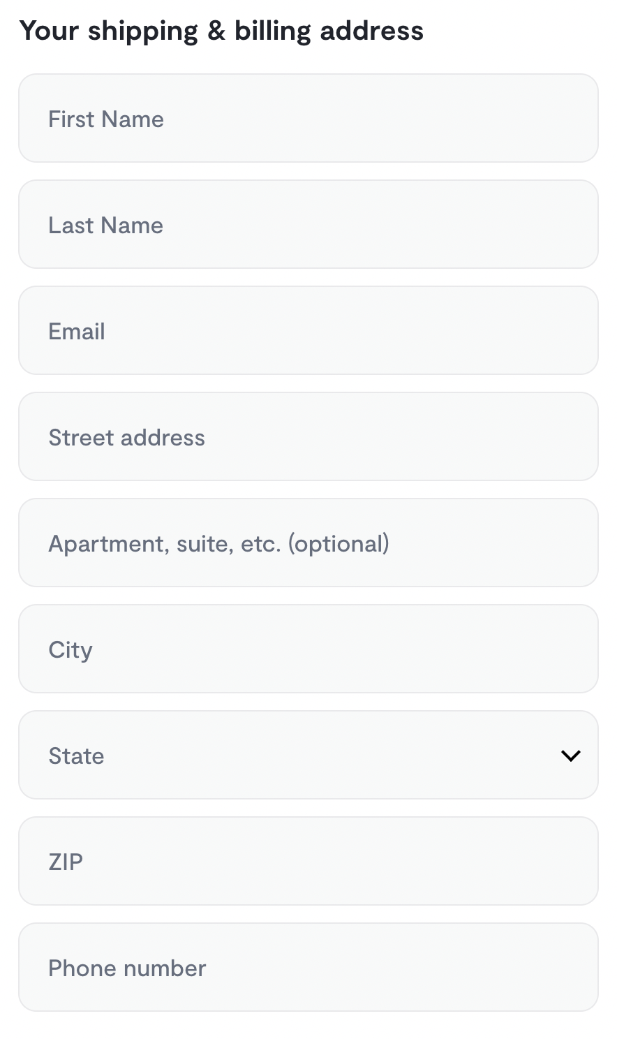
Tempo falls into the trap of the disappearing placeholder text with no labels to guide someone. The solution is simple: Add labels, and use the placeholder text for helpful hints.
Happy UX writing 🖖


